




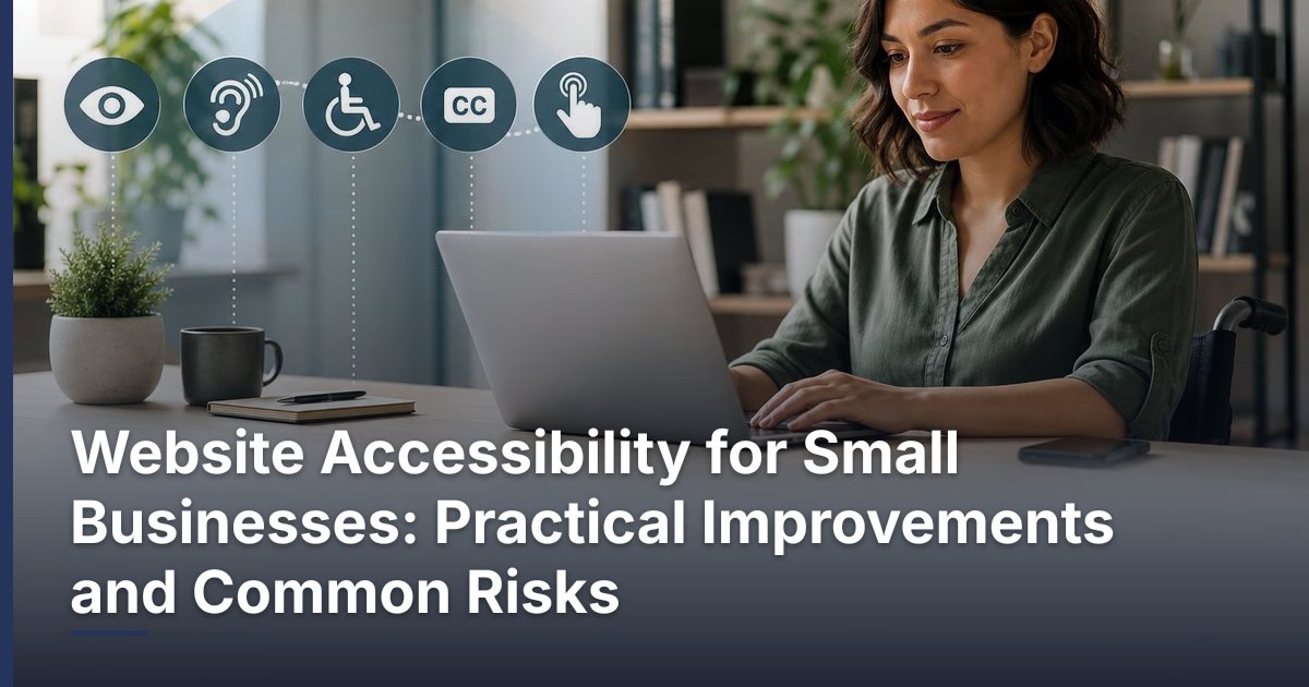
Website Accessibility for Small Businesses: Practical Improvements and Common Risks
Prepared 2026-11-10
Website accessibility for small businesses means making key online tasks easier for more people to understand and use. Start with the customer journeys that support your business, remove obvious content and interaction barriers, and build simple checks into future website updates. Accessibility can also involve legal considerations that vary by business and jurisdiction, so this article is practical guidance rather than legal advice.
What website accessibility means in practical terms
For a business website, accessibility is the practical work of reducing avoidable barriers that can stop a visitor from finding information or completing an important task. It affects more than a site’s colors or font size. A visitor may rely on a keyboard rather than a mouse, need clear visual contrast, use software that reads page content aloud, enlarge the page substantially, or need extra time and clearer instructions to complete a form.
The useful question is not whether a site looks modern. Ask whether a prospective customer can independently understand the page, move through it, and complete the action your business needs them to take. That may be calling your office, requesting an estimate, scheduling a service, adding an item to a cart, or paying an invoice.
Accessibility should not be treated as a legal conclusion or a badge a business can claim after one round of edits. Requirements and risk can depend on the organization, its location, its audience, and how the site is used. Obtain qualified legal advice for questions about obligations that may apply to your business.
Where a small business should start
Trying to review every page at once can make the work feel unmanageable. Start with the few journeys that have the greatest effect on customers and operations. A service business may begin with its contact page, service pages, quote form, and appointment workflow. An ecommerce business may begin with product discovery, the cart, checkout, account access, and order-support pages.
| Priority area | What to review | Why it matters for a small business |
|---|---|---|
| Core customer journeys | Contact, quote, booking, purchase, login, and account tasks | These actions often support leads, service delivery, or revenue. |
| Content clarity | Headings, link wording, image descriptions, and instructions | Clear content helps visitors understand what to do next. |
| Keyboard operation | Menus, forms, buttons, pop-ups, and dialogs | Some visitors navigate without a mouse. |
| Ongoing changes | New pages, campaigns, documents, plugins, and embeds | Accessibility can be affected whenever the site changes. |
Write down the starting point before changing anything. List the pages involved, the desired customer action, the tools or vendors involved, and the person responsible for each fix. This turns a broad concern into a manageable work list and helps prevent important issues from being lost among routine marketing requests.
Practical improvements to review first
Use content that explains itself
Pages are easier to follow when headings describe the topic below them and appear in a logical order. Link text should tell a visitor what will happen next instead of relying on vague labels such as “click here” or “learn more” with no surrounding context. When an image communicates information, provide a useful text alternative that conveys its purpose; decorative images generally do not need to carry the same burden.
Make forms understandable before submission
Forms are often where a promising visit becomes a lost lead. Make the purpose of every field clear, distinguish required information from optional information, and provide instructions before a visitor submits the form. If there is a problem, the message should identify what needs attention and help the person correct it. Avoid relying on color alone to signal an error or required field.
Check operation without a mouse
Use the Tab, Shift+Tab, Enter, and arrow keys to try the site’s primary actions. You should be able to see where keyboard focus is, move through navigation in a sensible order, open and close menus or dialogs, complete forms, and reach controls such as search, cart, and checkout. A visible button is not necessarily usable if focus cannot reach it or becomes trapped inside a pop-up.
Review visual readability and responsive behavior
Look for text that is difficult to read against its background, instructions communicated only through color, content that overlaps when enlarged, and buttons that become hard to activate on a small screen. Keep design decisions tied to task completion: a promotional animation, stylized text treatment, or unusually subtle control may look appealing while making a critical action harder to use.
Common risks that get missed
A redesign can improve visible pages while leaving the highest-risk interactions untouched. Booking widgets, payment processors, live chat, maps, cookie notices, customer portals, pop-ups, and embedded forms are separate pieces of the customer experience. Test them as part of the same journey rather than assuming the main website theme determines their usability.
- Publishing a scanned or poorly structured document that visitors cannot readily use.
- Adding a campaign landing page with an unclear form or missing error guidance.
- Installing a plugin that changes navigation, pop-ups, or checkout behavior without retesting key tasks.
- Using auto-playing media, motion, or time-limited interactions without considering how visitors control them.
- Relying solely on an automated accessibility scan and never testing the real customer journey.
- Declaring the site compliant or risk-free without qualified review.
Automated tools can help identify patterns worth investigating, but they do not replace human review of content meaning, task flow, or the experience of people using different assistive technologies. Treat a scan as an intake list, not a final verdict. Prioritize findings that interfere with a customer’s ability to complete a core action.
A repeatable process for making progress
- Map the most important customer journeys and identify the pages, forms, documents, and embedded tools involved.
- Perform a basic manual review of clarity, keyboard operation, visible focus, form labels, instructions, and error feedback.
- Use an automated tool to surface additional issues for investigation; record findings in a prioritized list.
- Fix the issues that block or confuse people during high-value tasks, then retest the entire journey rather than only the edited component.
- Review other templates, documents, and third-party tools for similar patterns.
- Add accessibility checks to content publishing, design review, plugin selection, and future development work.
- For significant risk, complex functionality, or legal questions, involve appropriately qualified accessibility and legal professionals.
Documenting decisions is valuable even for a small team. Keep a simple record of what was reviewed, what was fixed, who owns the remaining work, and which external tools need vendor follow-up. This makes accessibility part of ordinary website stewardship instead of an emergency project that disappears after launch.
How to work with a web partner or software vendor
When you hire a web partner, ask them to explain how they will review the important journeys on your site, not just the visual design. Share the real tasks customers need to complete and identify integrations early. A good scope distinguishes between content updates your team can make, template or code changes, and limitations within third-party platforms.
- Which priority journeys will be tested before launch?
- How will keyboard behavior, form feedback, navigation, and responsive layouts be reviewed?
- Which third-party tools are included in the review, and which require vendor confirmation?
- How will issues be documented, prioritized, and retested?
- What publishing guidance will our team receive for new images, documents, pages, and forms?
- What claims, if any, are the provider unwilling to make without formal assessment or legal review?
For a WordPress or WooCommerce site, accessibility work may span the active theme, custom templates, page-builder components, plugins, product content, checkout extensions, and embedded services. Changes should be tested in the live customer flow, especially after platform or plugin updates. DLR Vortex Solutions can help businesses scope website improvements, redesigns, integrations, and ongoing website work around their actual customer journeys.
Make accessibility a maintained business practice
The most sustainable approach is to connect accessibility to the way your team already manages the website. Before publishing, ask whether the page has a clear heading structure, understandable links, purposeful image descriptions, readable content, and a working form. Before enabling a new tool, test the task it affects. After a material change, revisit the customer journey from start to finish.
Start with the work most likely to remove a meaningful barrier for a customer. Then expand the review systematically instead of waiting for a full redesign. If you need help identifying and prioritizing practical website improvements for your business, schedule a consultation today!
Frequently asked questions
What is the first accessibility improvement a small business should make?
Start with the highest-value customer task on your website, such as contacting you, requesting a quote, booking, buying, or signing in. Review the complete path around that task, including forms and any embedded tool, then fix the barriers that stop a visitor from completing it.
Can an automated accessibility tool make my website accessible?
No tool should be treated as a complete answer. Automated checks can help identify issues for review, but a person still needs to assess content meaning, form instructions, keyboard flow, and whether a customer can complete a real task.
Do third-party widgets affect website accessibility?
They can. Booking systems, payment tools, chat widgets, maps, pop-ups, cookie notices, and embedded forms are part of the visitor experience. Include them when testing the customer journey and ask vendors how they handle accessibility concerns.
What should I check in a website form?
Check that each field has a clear purpose, required fields are identified clearly, instructions appear before submission, errors explain what needs to be corrected, and the form can be completed with a keyboard. Do not rely on color alone to convey errors or instructions.
Is website accessibility a one-time project?
No. New content, plugins, campaigns, documents, and integrations can introduce new barriers. Build a short review into normal publishing and website-change processes so the work continues after the initial improvements.
Does this article tell me whether my business is legally compliant?
No. This is practical website guidance, not legal advice or a compliance determination. Legal duties and risk can vary by organization and jurisdiction, so consult qualified legal counsel for advice about your specific situation.
Related reading
Schedule a consultation today!
Recent Posts


November 20, 2026
Ecommerce Product Page SEO: A Practical Optimization Checklist

November 19, 2026
How to Reduce Cart Abandonment on a WooCommerce Store
Related Articles
Technical SEO Audit Guide: How to Find and Prioritize Website Problems
Warning: Undefined variable $taxonomy in /home/u765721910/websites/azJno66uV/public_html/wp-content/themes/bw-digiflow/bzotech-templates/posts/grid/grid-style2.php on line 50


Leave a comment