





How to Reduce Cart Abandonment on a WooCommerce Store
Prepared 2026-11-17
To reduce cart abandonment on a WooCommerce store, first identify where shoppers leave, then remove the specific uncertainty or effort that stops them from finishing. In practice, that means clearer costs and policies before checkout, a shorter and easier checkout flow, reliable payment testing, and a careful recovery process for shoppers who have given permission to be contacted.
What cart abandonment can tell you
A cart that does not become an order is not a single diagnosis. A shopper may be comparing options, may not be ready to buy, may encounter an unexpected cost, or may have trouble using the site. The useful question is not simply how many carts are left behind; it is where the purchase journey becomes less clear or harder to complete.
Treat the customer journey as separate stages: product page, cart, checkout, and payment completion. If people leave before adding products, the issue may be product information or buying confidence. If they leave after starting checkout, fields, delivery details, payment choices, or technical behavior may deserve closer attention. This distinction prevents a store from applying a discount when the real problem is a broken mobile checkout.
| Store stage | What to inspect | Practical improvement to consider |
|---|---|---|
| Product page | Price, variations, stock messages, shipping and returns information | Clarify key purchase details before shoppers add an item to the cart. |
| Cart | Order total, shipping estimate, coupon behavior and cart editing | Keep totals understandable and let shoppers correct quantities or remove items easily. |
| Checkout | Required fields, validation messages, order summary and navigation | Remove unnecessary fields and make completion errors specific and easy to fix. |
| Payment | Available methods, payment errors and mobile interaction | Test every offered payment path on a phone and desktop using the same conditions a customer faces. |
| After contact capture | Consent, return-to-cart link and follow-up timing | Use an appropriate, permission-based reminder that helps a shopper resume their purchase. |
Make the purchase decision clearer before checkout
A checkout cannot repair every unanswered question from the product page. Before shoppers add an item to the cart, they should be able to understand what they are buying, what it costs, what choices are available, and what constraints apply. For physical products, that commonly includes variations, availability, fulfillment expectations, shipping information, and returns information. For services, digital products, or subscriptions, the relevant commitments may be different, but the principle is the same: explain the purchase in plain language before requesting payment.
Avoid late-stage surprises
A shopper who first sees a material cost, delivery limitation, or policy condition near the payment button has to reassess the purchase under time pressure. Place important information where it helps the shopper decide, rather than treating it as fine print. This does not mean putting every policy paragraph on every product page. It means making the information that affects the buying decision easy to find and internally consistent across product, cart, and checkout pages.
- Present product price and the information needed to understand what is included.
- Explain variation choices and availability clearly, especially when a selection changes the order.
- Make delivery, pickup, or fulfillment expectations easy to locate before checkout.
- Provide a clear path to return, exchange, cancellation, or support information that applies to the purchase.
- Review coupon messaging so shoppers are not encouraged to leave checkout to search for a code.
Design a checkout that asks less and explains more
Checkout is a task screen, not a general-purpose marketing page. The shopper should be able to confirm the order, provide necessary details, choose a payment method, understand any issue that occurs, and finish. Each additional field, unexplained validation rule, pop-up, redirect, or competing navigation choice deserves scrutiny because it adds work or uncertainty.
Start with necessity. Ask for information required to fulfill the order, process payment, meet applicable operational requirements, or provide appropriate support. If a field is only helpful for future marketing or internal preference, consider whether it belongs after purchase, in an optional form, or not at all. Do not remove information your operations genuinely need; instead, make the reason for collecting it understandable when that would help the shopper.
| Potential friction | What the shopper experiences | Response to test |
|---|---|---|
| Long or unclear forms | The task feels time-consuming or confusing | Remove nonessential fields, group related fields, and label inputs plainly. |
| Unclear field errors | The shopper does not know what to correct | Use specific validation messages close to the affected field. |
| Changing totals | The final amount is difficult to anticipate | Keep the order summary visible and explain charges before the payment decision. |
| Difficult mobile interaction | Fields, buttons, or payment controls are hard to use on a small screen | Test the complete checkout on representative phones and correct interaction problems. |
| Distracting exits | Promotions or navigation pull attention away from completion | Keep checkout focused while preserving access to essential help and policy information. |
Test the real customer path
An administrator session can hide problems that a new shopper sees. Run controlled test orders as a guest where that reflects the store experience. Test on more than one device type, try each available payment method, change quantities and variations, and deliberately trigger common field errors. Keep a short record of the steps, expected result, actual result, and owner for each correction. If a theme, checkout extension, payment tool, or caching change is involved, retest after it is deployed.
Use measurement to prioritize changes
Avoid relying on a single overall abandonment number to make decisions. Instead, define the events that matter to your store and compare the path between them over a consistent period: viewing a product, adding to cart, viewing the cart, beginning checkout, selecting a payment method where measurable, and completing an order. Use the same definitions when reviewing changes so results are comparable.
Also investigate qualitative signals. Customer-service messages, failed-order reports, payment-provider notices, on-site search terms, and direct feedback can reveal friction that event data alone cannot explain. A recurring question about shipping or an error reported only on a certain device can point to a high-priority test even when aggregate reporting looks normal.
- Choose one part of the journey to improve, such as the shipping display in the cart or a specific checkout field.
- Write down the customer problem and the change you expect to address it.
- Confirm that tracking and order reporting are working before making the change.
- Make one controlled improvement rather than redesigning several elements at once.
- Review the relevant journey stages, payment behavior, support feedback, and technical errors after an appropriate observation period.
- Keep, revise, or reverse the change based on the complete evidence available to your business.
Do not treat a change as universally successful simply because one metric moves. For example, removing a field may make checkout faster but create fulfillment problems if that field was operationally necessary. The goal is a reliable customer experience and an order process your team can support, not a superficial reduction in form fields.
Approach abandoned-cart recovery responsibly
Recovery messages can help a shopper resume an interrupted purchase, but they work best after the store has addressed obvious checkout friction. A reminder cannot make unclear costs, unreliable payment behavior, or confusing policies disappear. It should be a straightforward continuation path for a shopper who chose to share contact information and can appropriately be contacted under the rules that apply to the business.
- Use the customer details and permissions your store has collected appropriately.
- Make the message identify the store and provide a straightforward way to return to the cart.
- Keep the message focused on helping the shopper resume, rather than creating unnecessary pressure.
- Ensure the cart link, product availability, price display, and checkout path work before activating automation.
- Coordinate recovery messages with customer support so shoppers can get help if an order issue caused the interruption.
- Review message content and contact practices with appropriate legal or privacy guidance for the business and markets served.
Discounts should not be the automatic first response. A discount may be appropriate for some campaigns, but it can also train shoppers to wait, reduce margin, or conceal an operational problem. First test clarity, checkout usability, and payment reliability. If you use an offer, define its purpose, audience, conditions, and measurement plan before deploying it.
Build a practical improvement plan
Begin with an audit rather than a redesign. Capture screenshots of the current product, cart, and checkout experience, then walk through the process as a new shopper. List each point of effort or uncertainty, along with any technical errors. Match those observations to your journey reporting and customer feedback. This creates a prioritized backlog instead of a collection of opinions about what a checkout should look like.
A sensible order of operations
- Fix broken checkout, payment, mobile, and order-confirmation behavior first.
- Clarify costs, fulfillment expectations, policies, and product-selection details before checkout.
- Simplify only the fields and steps that are not required for a dependable order process.
- Improve tracking so the team can distinguish cart exits, checkout exits, and payment issues.
- Introduce or refine permission-based recovery communications after the primary journey is dependable.
- Continue testing individual improvements as products, shipping rules, themes, payment methods, and customer expectations change.
WooCommerce stores often have multiple moving parts: the theme, extensions, payment providers, shipping configuration, analytics, email tools, and custom code can all affect checkout. A focused technical review can help identify where those components conflict or create unnecessary work for shoppers. DLR Vortex Solutions can help business owners assess the customer journey, improve WooCommerce checkout experiences, and connect the supporting marketing and automation systems. Schedule a consultation today!
Frequently asked questions
What is cart abandonment in a WooCommerce store?
Cart abandonment refers to a shopper adding products to a cart but not completing an order during that purchase journey. It is more useful to examine where the shopper leaves—product page, cart, checkout, or payment—than to treat every unfinished cart as the same problem.
Should I remove every optional field from WooCommerce checkout?
No. Remove or relocate fields that are not needed, but retain information required to fulfill the order, process payment, support the customer, or meet the store's legitimate operational requirements. Test changes carefully so a shorter form does not create downstream fulfillment issues.
Do abandoned-cart emails solve checkout abandonment?
They can help eligible shoppers return to an interrupted purchase, but they do not fix unclear costs, poor mobile usability, payment errors, or confusing policies. Address the checkout experience first and use recovery communications as a supporting process.
Should a WooCommerce store offer a discount for every abandoned cart?
Not necessarily. A discount may fit a defined campaign, but it can affect margin and shopper expectations. First investigate whether the store has an information, usability, payment, or technical problem that should be corrected directly.
How can I tell whether mobile checkout is causing problems?
Complete controlled test purchases on representative mobile devices and compare the journey with desktop. Look for hard-to-use fields, hidden buttons, unclear error messages, redirects, payment problems, and layout issues. Combine the test results with your store reporting and customer feedback.
What should I test first to reduce cart abandonment?
Start with critical completion issues: whether checkout loads reliably, payment paths work, order totals are understandable, and shoppers receive a confirmation after purchase. Then review product information, cart clarity, form length, mobile usability, and recovery communications one change at a time.
Related reading
Schedule a consultation today!
Recent Posts


November 20, 2026
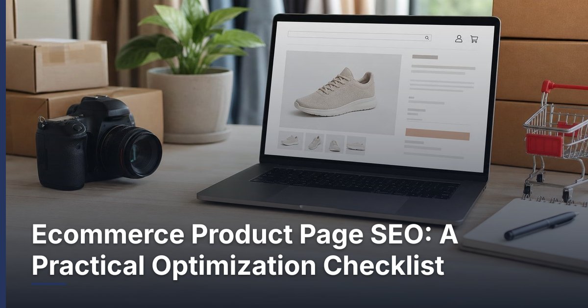
Ecommerce Product Page SEO: A Practical Optimization Checklist

November 19, 2026
How to Reduce Cart Abandonment on a WooCommerce Store
Related Articles
Technical SEO Audit Guide: How to Find and Prioritize Website Problems
Warning: Undefined variable $taxonomy in /home/u765721910/websites/azJno66uV/public_html/wp-content/themes/bw-digiflow/bzotech-templates/posts/grid/grid-style2.php on line 50



Leave a comment